How can we help?
Utilization Charts
Target Utilization Chart
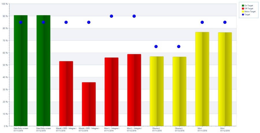
The Target Utilization chart displays a desired utilization number next to the actual utilization for each piece of equipment. Colors are used to identify how close the actual values are within the defined targets. The definition for utilization can be set using the filter options including the percentage for each of the utilization colors as well as choosing a view.
Required and Optional Information
For all Utilization charts a time frame and one or more pieces of equipment must be selected. Once the equipment has been selected the Finish and Next buttons become available. At this point the chart can be generated without specifying any additional information by pressing the Finish button. Additional filter information can be selected by pressing the Next button. After clicking the Next button the second page of the filter can be used to select the type of statuses to be compared. By default the General Cycle status is selected but you can choose specific if desired.
There are two layouts for the View, a Clustered Column or a Single Column.
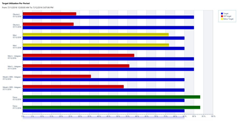
The Clustered Column View has a bar for the Target and a separate bar for the actual value.

The Single Column View has a large dot for the Target and a column for the actual value.

Chart Options
By filling in the Utilization % and pressing the Finish button the desired utilization target percentage can be set for each piece of equipment selected along with setting the colors that will be used in the charts.
- Chart Type: Choose between Single Column and Clustered Column depending on viewing preference.
- On Target: The color that will be used if the actual value is within or above the specified target threshold.
- Below Target: The color that will be used if the actual value is lower than the On Target value but higher than the Below Target value.
- Off Target: The color that will be used if the actual value is lower than the Below Target minimum.
- Sort By: Choose to sort the chart results by name or percentage.
- Exclude greater than: Exclude any utilization percentages greater than the entered amount from showing on the chart.

Utilization Per Period Chart
The Utilization Per Period chart displays a desired utilization number next to the actual utilization for each piece of equipment over the course of a selected time period. Details are broken out so that you can compare details of specific machines over a time period. Colors are used to identify how close the actual values are within the defined targets. The definition for utilization is set using the filter options including the percentage for each of the utilization colors as well as choosing a view.
Chart Options
- Chart Type: Choose between Single Column and Clustered Column depending on viewing preference.
- On Target: The color that will be used if the actual value is within or above the specified target threshold.
- Below Target: The color that will be used if the actual value is lower than the On Target value but higher than the Below Target value.
- Off Target: The color that will be used if the actual value is lower than the Below Target minimum.
- Sort By: Choose to sort the chart results by name or percentage.
- Exclude greater than (%): Exclude any utilization percentages greater than the entered amount from showing on the chart.


Target Utilization Trend Chart
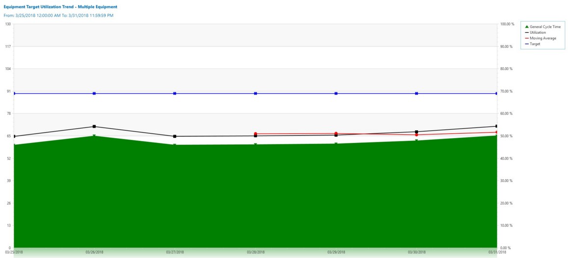
The Target Utilization Trend chart displays machine utilization data in the form of a customizable trend chart. This enables the user to compare cycle time, utilization, target utilization, as well as a moving average of the utilization. By default, there are four different data points that are displayed when running this chart. These include the Target, a Moving Average, the selected Cycle Statuses, and actual Utilization. This chart is designed to allow you to see how a single or group of machines have been utilized over a course of configurable time. Depending on the query size for the chart, you can organize the data by day, week, or month. This chart is not typically used for data sets smaller than a few days in size.
Chart Options
- Cycle Status: Choose between General Cycle Status or any combination of Specific Cycle Statuses.
- Group By: Group Data by Daily, Weekly or Monthly.
- Target Utilization: This option determines whether Target Utilization is displayed. This metric is displayed based off a weighted average of the target. For instance, if you had the target set at 100% for half a day and 50% the other half, your target would be 75% for that machine. The same thing would apply to two machines. If one machine had a target of 90% and the other machine had a target of 80% your target would be 85%.
- Moving Average: This is the option to include or not include the Moving Average metric. This represents the average utilization over the last ‘x’ amount of time bins where ‘x’ is the Moving Average Size.
- Moving Average Size: This option allows the chart to generate an average line graph based off the size that is entered.
When the report is generated using a single machine, the name of that machine is displayed in the header of that chart. If more than one machine is selected, the title of the chart will display “Multiple Equipment” within the header.

Additional Utilization Settings Information
Utilization metrics can be configured using the Manage Metric Targets form.