How can we help?
Timeline Charts
Overview
Timeline Charts display a stacked bar chart on a time line showing the incremental statuses of the equipment over the time range selected. The Equipment can be selected by User Groups, Company Groups, or individual Equipment. When displaying the result the time line can only be shown for individual equipment, not consolidated into groups.
Required and Optional Information
A time frame and one or more pieces of equipment are required to generate timeline charts. Once the equipment has been selected the Finish and Next buttons become available. At this point timeline charts can be generated without specifying any additional information by pressing the Finish button. Additional optional information can be selected by pressing the Next button.
The second page of the filter can be used to select the type of statuses to be compared. By default the General statuses are selected. In addition, the scale can be set to display on even hour intervals rather than being generated automatically.
General and Specific Status
For the Cycle status either general status, an individual specific status, or all of the specific statuses can be selected. As an example of selecting a single specific status, let’s assume there are two specific statuses in use: Machine Time and Spindle time. Machine Time has been setup to be active any time the equipment is running. Spindle Time has been setup be active only when there is a load on the spindle. By selecting Machine Time or Spindle Time as the specific status the time line chart will utilize the appropriate amount of time as the cycle time and therefore providing different results for the amount of time the equipment has been in cycle. Selecting All Specific Statuses from the drop down menu will display each of the defined specific cycle statuses on the timeline chart.
For Planned and Unplanned Downtime either the General Status only or the Specific Statuses can be viewed.
Equipment Status Timeline Chart
The Equipment Status Timeline chart displays a basic timeline for each selected equipment over the desired date range. A preset date range or custom dates can be selected as desired.
Additional Timelines
The timeline chart allows additional, optional timelines to be shown for each equipment. By default, only Equipment Status timelines are visible. Under Data Type, Connectivity and Part Number timelines can be added. The width of each timeline can also be set to Wide or Narrow. The Part Number timeline also has the option to show Part Counts when they occurred. Hover the mouse over a Part Count or any timeline section for additional information.
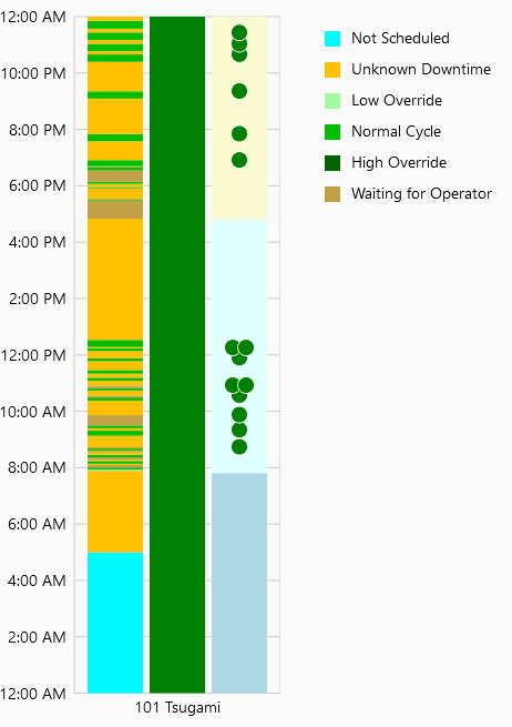
Timeline Summary
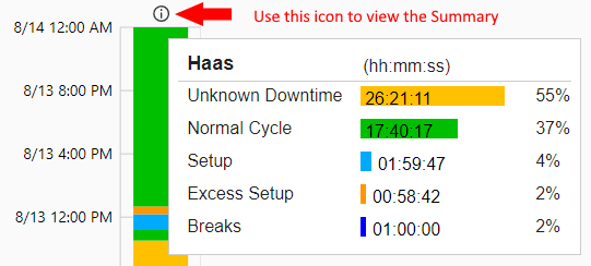
Enabling the Status Summary option will add an icon to the top of each Equipment Status timeline. Hover your mouse over or tap on the icon to view a summary of the data.
Timeline Per Period Chart
The Timeline Per Period Chart will display a stacked bar chart for each equipment selected over the desired period of time. As opposed to the Timeline Chart which displays a single timeline representing the entire date range for each equipment, the Timeline Per Period Chart will split the timeline between each day or week in the selected date range.
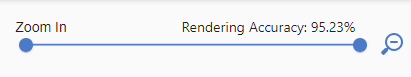
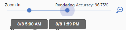
Rendering Accuracy
While viewing a Timeline or Timeline Per Period chart a percentage value will be displayed at the top. The percentage represents the amount of granular data displayed on the chart which may change when you zoom in. When shorter cycles are not displayed, the percentage is reduced accordingly. If a shorter status is not displayed on the chart (for example, a status lasting a few seconds on a timeline for an entire day), it will also be ignored by duration values in the tooltip.
Zooming In and Out
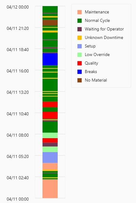
When there is a lot of equipment status activity and the equipment status timeline chart is run for a long period of time it is difficult to see the short cycles and some statuses with even shorter time frames simply cannot be shown. To address this issue the equipment status timeline has the capability to zoom in on the data. Here is a look at how the zooming works.
The goal will be to dive into the data around 6:00 am when the machine was running in low feed rate override which is shown in light green.
To zoom, ensure the cursor is anywhere within the grid area of the chart then click and drag. Release the mouse button after dragging over the area to be zoomed in on.
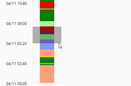
Alternatively, click and drag on the Zoom In bar at the top of the screen to select a specific period.
Now all of the detailed activity which took place around the time frame in question is easily visible.
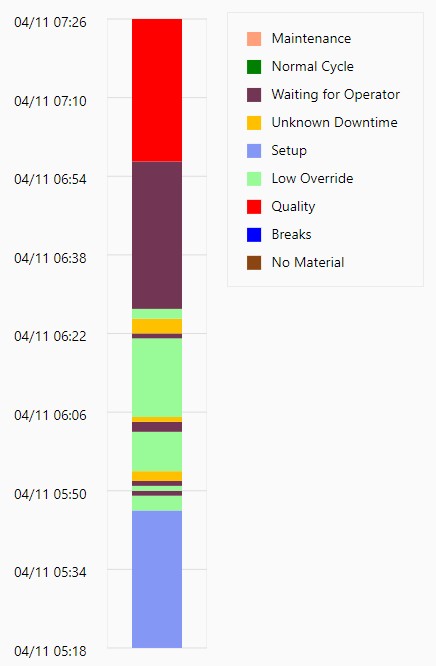
The data can be zoomed in again by dragging over the desired area. The chart can be reset by clicking the magnifying glass icon at the top of the chart.
